2. Hold down Command when pressing Delete to bypass the annotation-is-being-deleted warning. This is a middle ground, I could remove the requirement for the modifier key if people don't want it.
Is the delete action Undo-able (by command-Z)? If not, perhaps err on the side of caution to keep the modifier key.
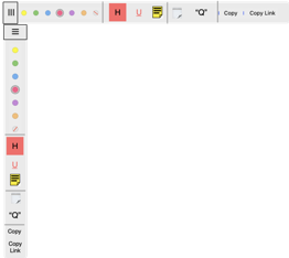
4. The double lines between some options in the selected text popover divide the options into 3 logical groups:
As one who suggested the grouping, I like the arrangements yet can also concede a case that the double lines could be eliminated. I might suggest only to move the Copy and Copy Link to the end of the groupings, as the others all add to or change the character of the PDF itself. Otherwise, I wonder if some of the words (highlight ... quote) might be replaced by icons (see below).
3. Sure the tiny title bar can be removed. But that would remove the red close window button that I'm sure some users find comforting (realizing that clicking outside the popover closes it, too). I hadn't thought of it as clutter. What do others think?
At the risk of appearing to request a major UI overall, I'll chime in on this. Please appreciate that I rarely annotate in the macOS version, and my suggestions should therefore take lowest preference against those from folks who do annotations in the macOS version.
I find the on/off behavior of the popover distracting. I would rather have the popover become active as a floating panel or as a bar that can be repositioned at the top, bottom, left, or right of the PDF window.
- menubar.png (26.3 KiB) Viewed 12346 times